#and the tutorials i saw on tumblr used the frame by frame method
Explore tagged Tumblr posts
Note
How do you make the transparent vg gifs?
I used this website! Load your gif, set the background color to the color you want to remove and then play with the percentage until you get the shade you want gone (if the bg is one shade of green, then 1% will do the trick, if it's multiple shades of green, you'll need to go higher). Also turn off and on the Alpha Channel Preview to make sure you're not deleting any pixels of the character
BIG warning tho, I used this on gifs that had a very simple background, with one specific shade of violet and another specific shade of yellow, so I was able to colorpick the code of both and then set the percentage at 1% to only target those colors (I had to do this with one color, then save the gif, then load it again and finally delete the remaining bg color)
If you are working with something more complex, it will be more difficult, and you'll probably need to do some color adjustments in Photoshop to make the background colors different to the character's (for ex, if you want to delete the background of a gif with Mario in it, you'll need to make sure the bg doesn't contain red, orange or blue)
Otherwise you can remove the background with Adobe After Effects or do it in Photoshop frame by frame, but obvs that takes more time. Couldn't find anything more efficient than these methods sadly :(
#asks#ysiposting#i thought i would be able to do it fast with photoshop but alas...................#and the tutorials i saw on tumblr used the frame by frame method#if anyone knows how to remove backgrounds from gifs more efficiently please do share your secrets 🙏
8 notes
·
View notes
Note
hi! this is going to sound extremely stupid, so pls bear with me. i found your one of your gif tutorials by chance and i saw that you mentioned how to get rid of the transparent borders around gifs and i was wondering if you could elaborate on it, bc let me tell you, those annoying 1px borders are taunting me.
hey, sure! this is not a stupid question at all.
so you probably saw here that all my crop presets are two extra pixels than they need to be. this is because the action set that i use to load my screencaps and convert them to frames includes a step that adjusts the canvas size and subtracts those two pixels for me once it's in frame animation.
the last step in the "convert to animation (frames)" action is this:

so when i play the action, i end up with a properly sized gif for tumblr depending on which crop preset size i used.
to do it manually, for example if you're making a big square gif for tumblr you would crop your footage in timeline animation to be 542px by 542px, then once you're in frame animation go to Image > Canvas Size and enter -2 pixels to the width and height with "relative" checked.

this will ensure that when you save your gif, it won't have that pesky border against dark backgrounds on tumblr. you could also apparently do this, but i prefer this cropping method as it guarantees the best result.
i also really recommend doing the crop trick because sometimes i see gifs where the footage itself has a black line at the top or bottom of the gif because the op cropped it up against the very edge of the frame. i always suggest cropping a few pixels away from the edge of every gif you make to avoid this. but if you don't, this action might take away that weird line if the footage ever has it, so you kill two birds with one stone.
disclaimer: like i said, i only use that action set for loading my caps and converting to frame animation. i use my own sharpening in between, but that action set includes fantastic sharpening options to experiment with and it definitely speeds up the whole process!
5 notes
·
View notes
Note
hi!! i wanted to know if you'd be willing to make a tiny tutorial / explanation on your sizing for gifs and how you get such good quality?? i just started making gifs yesterday and i fear i have a lot to learn....
OMG thank you for thinking I'm worth asking something like this but believe it or not I just started making gifs myself, about a month ago! I wouldn't feel confident enough to give you a tutorial but I can give you all the info I've learned and the tutorials I use!
First for gif sizing the only metric that matters is width: 540px for 1 gif by itself | 268px for 2 gifs next to each other | 177px for 3 gifs next to each other. Height doesn't really matter, also gifs should be less than 10MB in size as that's Tumbr's limit.
This is the tutorial I've used for sharpening I liked this one 'cause it has the usual 2 filters I saw other gif makers suggest plus an additional layer and so far I like it the most. The main thing is also to always try to download the highest quality video too, 1080p at least, but if your computer/laptop or whatever you're making gifs on can handle higher quality videos you can download those too (I use this website to download videos off YouTube, but there are others too, use what you prefer!)
And this is the tutorial I've used to blur text/logos on my sets. I saw some other methods but this one was the easiest/simplest for me to understand. But not everyone cares even if you don't blur stuff to start, some of my first sets I didn't blur anything and they did better than I could have expected.
Finally, to go back to Tumblr's limit I learned this the hard way at first but it's important to keep in mind the number of frames in your gif (I always set my limit at 180 or less frames in a single gif, otherwise it ends up over 10MB), BUT another way to try and reduce MB size when exporting on Photoshop (assuming you're working from PS) is changing up the settings to make the file smaller without having to cut too many frames if it still ends up a little big. You won't always have to do this if you use less frames (using the default settings is fine which for me are selective/diffusion) but it's helped me a few times not have to cut anything even if it ends up a little over 10MB originally.
For example from my last set:

This is what my export settings were, the quality can change between using selective or adaptive, or diffusion or pattern (these are the common choices). For this set I chose adaptive and pattern and it gave me the smallest MB size without losing the quality. I don't change much else. I also set my quality bar to bilinear instead of bicubic 'cause I just prefer it and I saw some other gif makers have it at that setting too so I just leave it like that.
I hope some or any of this is useful to you! I also find it helpful that if none of these tutorials are what you want there are a ton of resources here and on YouTube too that I read when I see them or watch if I need to see examples, it's definitely a learning process but I've been enjoying it and I hope you do too!
1 note
·
View note
Note
Just wondering how you make your GIFs? I’d like to make some for Chicago Med but never done it before and saw you made some for movies and shows
- @allthosedarlings 🥰
I use Photoshop 2021 to make my GIFS!! Omg I think I may have wrongly mentioned 2022 before but I don't think a 2022 edition exists for it? 😂❤ There's no fancy magic to my method, I just change the speed of the frames for my GIFs and mess around with the adjustments, from saturation, contrast, which colours to bring out!! 💗
I also take second by second screencaps of the film/show I'm making a GIF for but keeping it limited to 80-90 frames per GIF so it fits on Tumblr mostly 💀 If you're using Photoshop as software though, I can give much more of an in depth tutorial because it's the onyl one that I use! :'D
3 notes
·
View notes
Note
I saw on someone else's post that you offered to show them how to make gifs? I am super interested in making The Magicians gifs so I was wondering if you could teach me as well? Or even make a public post or tutorial or something? Thank you!!!!
Yeah, of course! There are a lot of ways to make gifs, some of them undoubtedly better than what I do. But, for me, I have a couple methods I generally use, one with Photoshop (when I want very specific control over the colors, composition, type styles, etc.), and the other with just a free tool (when I just want to make a gif that looks decent and not sink a ton of time into it).
I’ll go over the free tool method here; it’s more straightforward and limited, but wayyyy friendlier for someone just starting out. Also, again: it’s free. (But lemme know if you wanna talk Photoshop and I’m always happy to open that giant can of worms.)
One nice thing about gifs becoming the one true currency of the web is that a lot of gif-oriented sites have built gif-making tools in the past couple years and made them free and easy to use, so we can all become gif-producing worker bees, constantly toiling to keep up with the internet’s insatiable demand for gifs.
I use Gif Brewery 3 for mac, built by Gfycat. (There’s also Giphy’s GIF Capture which I’ve used a few times and didn’t hate.) So for the purposes of this tutorial, Step 0: Download and install Gif Brewery 3
So! Now let’s make a gif. Let’s say I want to make some gifs of Margo taking her throne as high king.
Step 1: Open Netflix in Google Chrome (i.e. not Safari because it blanks your screen if you try to record your screen while a video’s playing) or play a DVD on your computer, or pull up the scene you want on YouTube. Basically get a video of the scene you want playing on your computer screen in whatever fashion you prefer.
Step 2: Open Gif Brewery and select “Record Screen.” Resize the window that Gif Brewery then opens up so that it frames the video, hit record, and then play the part of the video you want to gif.

Step 3: When you’re done with video, click “Stop.” Gif Brewery will then open the video clip that you made in their interface. You can close your browser and the blue frame window. You can see the full clip you just recorded in Gif Brewery. Trim the extra bits off of the clip by dragging the green bar to define your start point and the red bar to define your end point.

Step 4: Resize! Tumblr’s main content box is 540 pixels wide. So if you’re making a gif that’s meant to be full width, you can size down to that width. Make sure “Maintain Aspect Ratio” is checked. (Now’s a good time to also crop if you want to, say, gif only Margo’s face without the space to her left and right.)
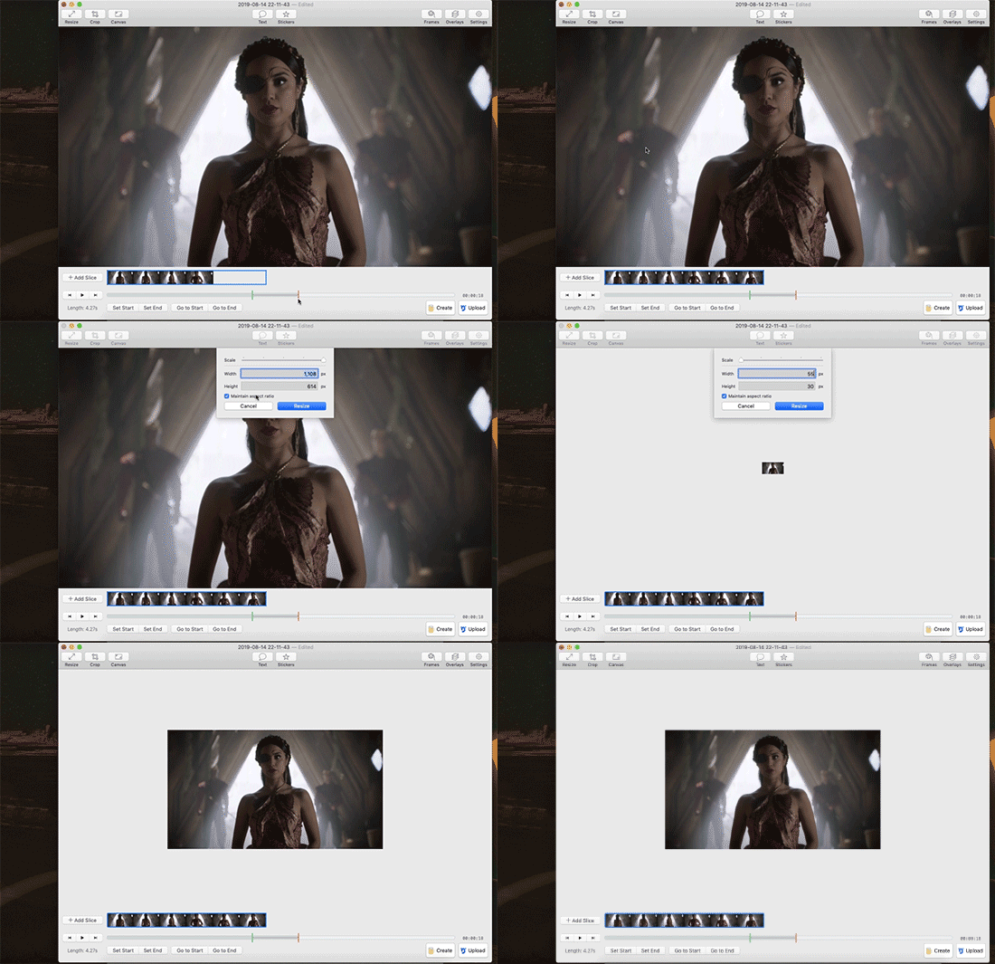
Step 5: So now we have something that’s the size and shape of a gif. If you want to add text, now’s a good time to do it. Use the “Text” button at the top of the window to open the Text box. Here you add your text, adjust the font weight, size, color, and border if you’re using one. I’m going to use a Billie Eilish lyric for this example because I’m cliche as hell.
If you’re making a standard-style gif with a text caption, you’ll use a bold san serif font like Helvetica, with a black border around it to make sure it’s readable, and then keeping it small and centered at the bottom of your gif, like so:

But! if you’re feeling Artsy, go nuts with your font choice and placement. Find a font that captures the tone your message and clip are conveying. You can find a wide range of free fonts on Google Fonts or good old DaFont. I want that badass Margo ‘tude, so I’m using a grungy font and Margo’s signature bright fuschia. Drag the text box to move and resize it until you’re happy with it.

Step 6: Time to fix your colors! Screen captured images basically always look more dark and muted than they should. The fix is to fuss and fuss and fuss and then fuss some more over the colors. Gif Brewery has limited color controls, but as I’ve learned, you can still spend an inordinate amount of time fussing over them. The Magicians makes this an especially good exercise in finding the limits of your patience because they’re always backlighting scenes in a way that blow out your brightness when you try to make even small edits. (Which is why I’m switching over to a different shot that’s easier to work with for this example. Margo’s hella backlit in our gif.)

Exposure Adjust: Increase exposure to make your brights brighter
Gamma Adjust: Increase gamma to make your darks richer
Saturation: Increase to make the colors as rich as they can be
Vibrance: I also like increasing vibrance for even more of a pop of color
Hue Adjust: their hue controls are funky, but you can make some minor adjustments if at this point your gif looks weirdly too red or yellow.
Play around until you find what looks good to your eye. For a gif that’s meant to look like it’s colored normally, watch out for things like: the whole thing looks too dark and you have to squint to see the details; you overbrightened and now the white is blown out and blinding; or you oversaturated so much things look pixely and glitchy.
Step 7: Open the Settings panel with the button at the top right. Time for more fussing to make sure the timing, frames, and settings are how you want them.

HERE’S THE THING: Tumblr does NOT let you upload gifs larger than 3mb. So everything you’re doing in this panel is a balancing game to keep your gif under 3mb without letting it look like trash. These are the settings you’ll fiddle with most often:
Speed is set to 100% by default. But you may want to slow it down, especially if your clip is only a couple seconds long. Slower means it’s easier to see the subtle changes in a character’s expressions and it makes the action look less jerky. The slower you set your speed, the more frames will be added to the gif, so keep an eye on that.
Frames per Second is what it sounds like. The lower you set this number, the fewer frames you’ll use, but the animation will look jerkier. You want enough frames per second that your animation looks as smooth as a hot knife sliding through butter. 12 is their default. I try to not go lower than 10. When I’m feeling particularly luxurious, I’ll set this to 15.
Color Count: Gifs can use as many as 256 colors and as few as 2, if you don’t care about your gif being an offense to nature. You can set it to the low 200s without compromising on quality, though, so that’s what I did here.
Step 8: Hit “Create” and wait an inordinate amount of time while your gif renders. When it finally, finally does, check the filesize on the bottom right. In the above gif, you’ll see my gif was 2.1mb. Perfect. So I can hit save and it’s done. But if it had said anything larger than 3mb, I’d have hit “Cancel” and then fiddled with the settings some more to get the number of frames down.
Alt-Step 6B: If I want to do anything fancier/artsy-ier/more unique than this kind of gif, this is when I’d usually crack open Photoshop. But there is some room for creativity within Gif Brewery. Let’s go back to Margo and look at some of our options:
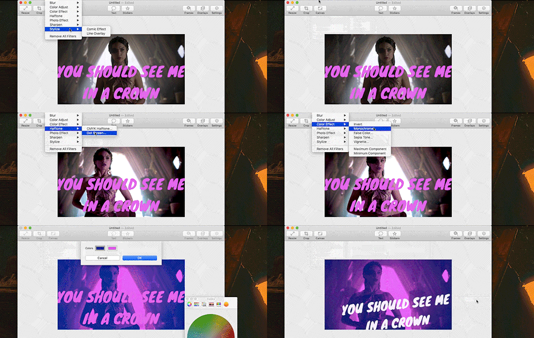
In the Filters menu, you can see there are a number of bre-built Photo Effects to play with. Sometimes they look awesome; sometimes they look like trash. So experiment! There’s also rando filters like Halftone effects. And the Color Effects can give you options like adding a vignette, fading the colors to old-timey sepia tones, or creating a duotone like I ended up doing.
Have fun with it and look for effects that will support the tone you’re setting with clip and text you chose. So like for this Margo example, going black and white, or dark and heavy, etc. would not have been tonally consistent with the badass vibe I’m going for.
And I… think that’s it? At least to get started. Hopefully that helps, let me know if you have any questions! Or want to talk about anything beyond the basics. I’m always happy to dive into the specifics of how a particular effect was made, or how to add more advanced refinements.
#bookster-lover#tutorial#pls don't judge my gif-making abilities based on#the shitty gifs I had to make to capture my screen
49 notes
·
View notes
Note
Hi, I'm about to have a crisis in tears. I don't understand how to use, make PSDs or even how to convert to a smart object or why I would even convert in the first place (its use). I want to make gifs but a lot of resources that pull up either in tumblr or google search doesn't lead me to anything recent (I guess bc people ask but don't tag or specify - so it doesn't pull in searches). Anyway, I saw some of your gifs and they are GORGEOUS GOALS. I thought maybe you might have some advice!
hi and there’s no need to cry! ps can be a bit scary at the beginning when we don’t understand what’s going on but i’ll try my best to help you explain what and how to do stuff and even do a tutorial of how i do my gifs :)
so first you need to get acquainted with ps and there’s this amazing long ass explanation about a lot of the major tools: photoshop for beginners by @shadowtravel and photoshop 101 by @yeahpsbesides ps usually people within the kpop fandom usually either use avisynth or vapoursynth as method of video/frame capture but there’s also people who use gomplayer, kmplayer, vlc or potplayer to capture frames for their gifs. it depends on what you like to use and also what type of computer you have! avisynth is used on windows pcs but it can also work on mac along with wine. vapoursynth is the same thing as avisynth but it’s made to especially to work on mac but it can be used on a windows pc too. resources/tutorials for each of the softwares:
avisynth: here by @brandinator
vapoursynth: here by @kuroblind
gomplayer: here by @4-velvets
kmplayer: here by @kristoffbjorgmans
vlc: here by @thosetutorials
potplayer: here by @gordonjims
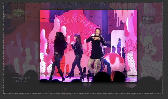
ok, let’s say you have the software you of your choice ready to go and now you can start making gifs - i’ll be referring to vapoursynth throughout this tutorial since it’s the one i personally use - you have chosen the video you want to gif too but keep in mind of what type of video your going to use! by this i mean if it’s an mp4, mkv, ts or tp file since mp4/mkv files don’t need the qtgmc feature of vs and it’ll make it take longer to encode for no reason since they don’t need it anyway. what is a ts/tp file you ask! well a ts file is a video stream file format and it’s used for video storing on dvds but in this case is used for mainly recording and keeping the quality of live performances and tv shows! ts means transport stream. this type of files are specified for mpeg-2 systems that compress the video data. altho you can find ts files that are h264/5 since it’ll give a better video quality than the mpeg. if you want to gif kpop performances and tv shows some twitter accs here. anyways the video i chose is:

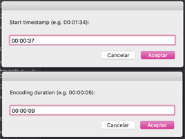
so i dragged the video to the vs icon on my dock and input the time i chose to gif, 00:00:37 and how much of the video i wanted 0.09 seconds:
after it runs it’ll open the resizer and the vs editor! on the resizer you’ll chose the size of the gif and the filters you want to apply to your video in these:

you can chose the dimension of the gif by messing around with this part of the resizer by pulling at it’s corners:
after you’re done it’ll give you an output that you’ll paste onto the vs editor:


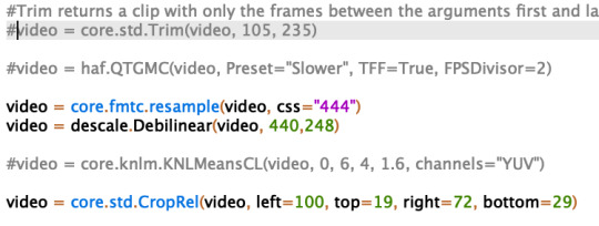
in the editor you can see how the output will look like by clicking f5 and from which frame to another it’ll go but you’ll have to put an # on all of the filters selected as well on the qtgmc and the trim, like so:
after clicking f5 this window will appear:
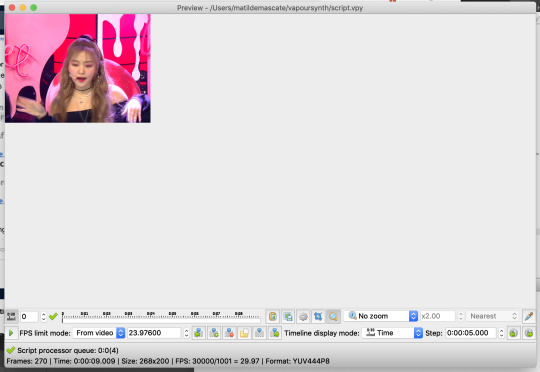
and this window will appear and you can see the video and chose the frames by clicking the play button and seeing where the part you want to gif starts and ends, then you input the number of those frames on the trim like so:

i wanted my gif to go from the 50th frame till the 125th frame. after this you’ll remove the # you’ve put and save the script you’ve created by clicking cmd+s and right after you’ll click f8 and this window will appear:

and the only thing you’ll change here is the header to Y4M:
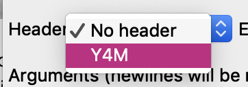
after this just click start and vs will start to encode the video and once it finishes just close vs. now you’ll input the frames onto ps by importing video frames to layers like so:
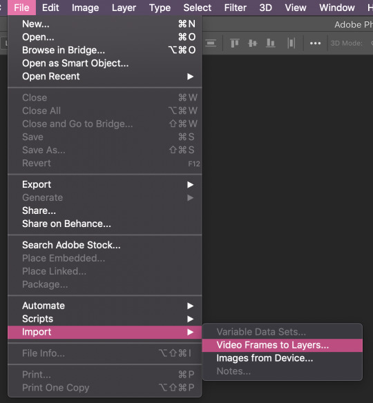
this window will appear and you click ok unless you want to take off more frames out of the output and you do that by moving around the cursors on the bottom of the video.
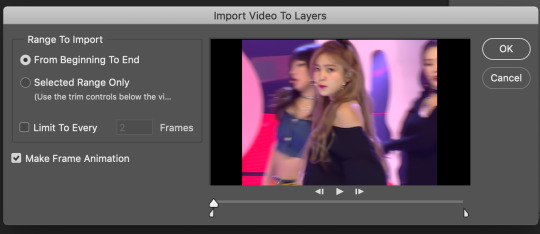
ok so now starts coming the part that you don’t understand i hope my explanation will make it clearer for you! so now after having the video open on ps you need to sharpen it, add topaz clean or denoise and for that to be done the quickest and applied to all the layers at the same time you need to convert your frames into smart objects! and you do it by clicking this symbol on the left corner of your timeline:

after clicking that it’ll look like this:

so now you select all your layers and go to filter and convert to smart objects, like so:
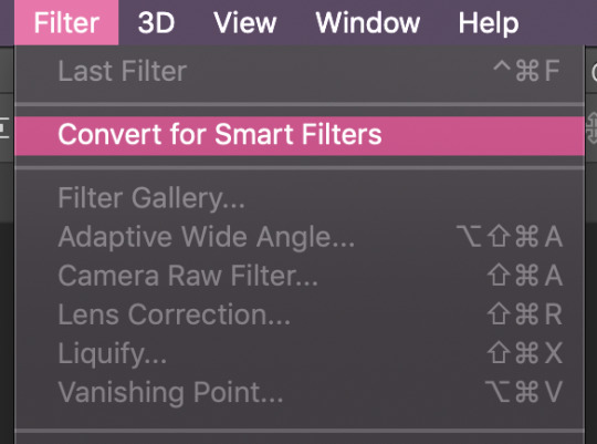
after doing that your layers will look like this and it’ll allow you to add smart sharpen and all that jazz. usually people use sharpening actions or make their own you can find really great one on these blogs: @yeahps @completeresources @chaoticresources @allresources @kaypoppsds and an actions is a series of tasks that you play back on a single file or a batch of files—menu commands, panel options, tool actions, and so on. you can have actions for anything and everything like for example resizing your gifs but in this case were talking about actions that are applied to make your gifs look better! and actions are found in this part:

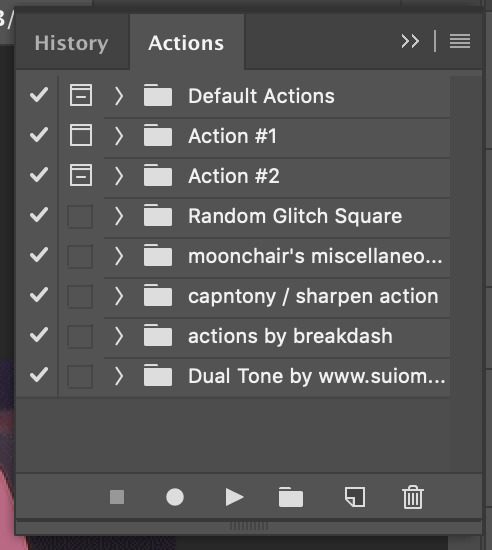
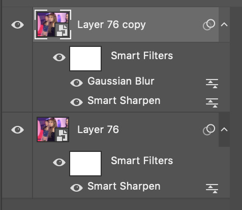
you just need to select the action you like and click the play button and it’ll apply the filters for you. so after all this you’ve applied the smart sharpen and for example the gaussian blur to your gif and so it should look something like this:
so now to make this smart object back into a gif you need to convert the layers into frames and you do that by clicking this symbol on the top right corner of your timeline:

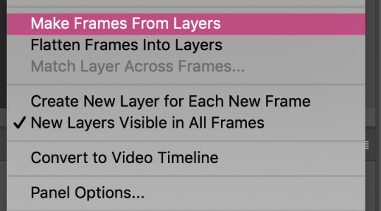
you let that run and it should go back to looking something like this:

and you’ll have to delete the smart objects you created. now you’ll have to convert the timeline to a frame animation so you’ll have to click that symbol on the bottom left corner of the timeline again:

and now you’ll have to select all of your frames and fast way to do that is by clicking the same symbol you did before on the top right corner of the timeline and click select all frames:
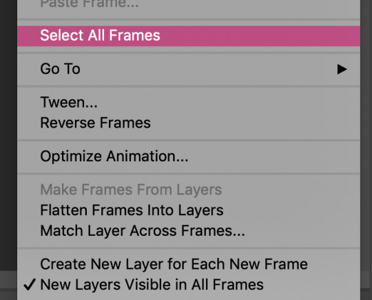
after that you to the frames and right click them and select other:
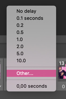
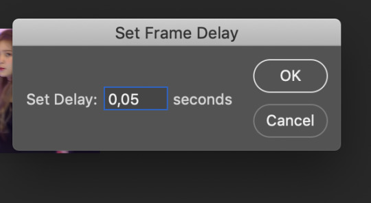
this window will appear and after you select the time just click ok:
so now onto the psd talk! a psd file is a layered image file used in ps and it stands for photoshop document, is the default format that ps uses for saving data. the psd allows the user to work with the images’ individual layers even after the file has been saved once. in gif making case it’s used to share colorings for gifs! and you can find great tutorials and psds on those resource blogs above!
i added this psd to the gif i making, by this i mean i opened the psd and dragged the group with all the coloring layers to the gif i was making! this psd i made myself by using the adjuments:
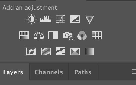
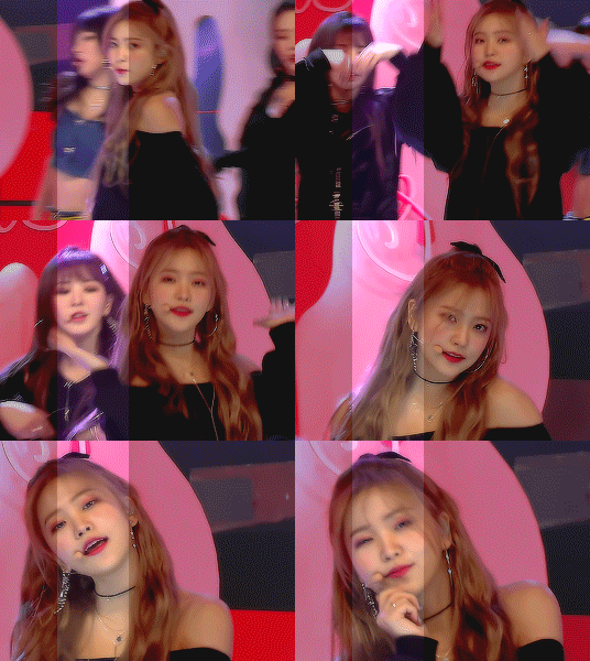
i personally mainly use: color balance, selective color, vibrance,hue/saturation, curves and brightness. and the psd as you can see acts like this on the gif, the darker part is the psd and the lighter part is the og coloring of the gif without the coloring:
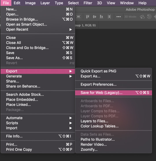
after all that you should have your gif done so all you need to do is save by clicking cmd+opt-shift+s or go file > export > save for web:
and this window will appear:
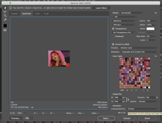
here you can see if your gif is under 3mb and if the looping is to forever! if it’s all set all you need to do is click save and at the end you should you have a gif like this ready to post:
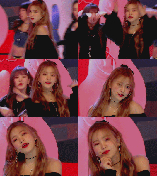
i hope this was in any way helpful!
45 notes
·
View notes
Note
wondering what program you use to animate? i saw your minish cap link gif on youtube and the quality looks SO CLEAN! ive been animating in photoshop (lol) but i have looking for a new program to use and potentially buy.
Hey, I have no clue how long this ask has been here becausetumblr never notified me! Thank you for the kind words though! :))
The short answer is I use Paint Tool Sai for drawing framesand backgrounds, photoshop CS6 for additional effects or color corrections, anda site called gifmaker.me which puts together your frames at the speed you wantwith extremely minimal quality loss (unlike Photoshop CS6 even at its highestexport settings >.>)
I’ll add more specifics of how I animate below if needed! (Thoughgoing in full detail might require a more in-depth tutorial with pictures)
If I’m going to use a gif as a base to animate like the MinishCap one, I’ll open the gif up in CS6 which splits it into frames- then I’ll copythose frames into sai.
Since Sai isn’t made specifically for animation it’s a bitof a hassle to set up but if you choose to use it my method is:
Make a folder for each animation frame containing: A layerfor your lineart, a layer for the animation base if using, your background, andone blank layer filled in with white so your lineart frames don’t all show onthe canvas at the same time. I can mimic onion skin mode to check betweenlayers by lowering the opacity of the current folder I’m working with, and alsochange the color of the lineart by selecting “Preserve Opacity” andcoloring/filling the lineart with the color I want.
When I’m done making frames, I export the file into CS6 andplay with the colors if I need to. One effect I always use is making a copy ofthe frame I want, giving it an overlay and Gaussian Blur effect with 20-30%opacity, and merge than with the original layer.
It’s tedious, butonce I do that with every single frame, I save each frame as its own image (basicallyjust pasting in MSPaint and saving as 1, 2, 3, etc.). I go to a site that putstogether frames without compressing them (or very small compression) like GifMaker.me,choose the speed I want the gif to play at, and save the gif! An alternative to gifmaker is EZgif, though I prefer the former.
A thing to keep in mind is that tumblr (at least the lasttime I checked) will NOT play gifs that are over 3MB, so if it goes above that,you may have to risk a bit of quality compressing your gif (I use EZgif forthat because I can choose the compression level I want!).
#asks#hhhhh please pardon my tendency to completely ramble#If anyone NEEDS me to ramble more let me know though!#tutorial#?#maybe?#ask june
4 notes
·
View notes
Text
Personal Branding - WIP
For this project, we were asked to have a web-based online portfolio, a CV and a showreel. During these last weeks, I have been working in all of these, starting from my website: https://albamingogallego.wixsite.com/hello
I used Wix as my website building platform cause I felt like it was the one which would help me get that clean look that I was going for much easier.
I actually started working on my website from the very first day that we hat the brief for this project as I was that excited about it. However, even though it went through tons of changes, I didn't keep track of almost anything of it. And, cause this is a website that is in constant evolution, I can't just open an older version and check out how was it looking. So, I will try to go through some of the processes here:
I began with this simple home/title:

I chose a picture from a character design from my first year that I like in look and colour. And decided to use my complete name ‘Alba Mingo Gallego’ rather than any other combination Alba Mingo (most used in Spain), Alba Gallego (plausible here) or Audrey Gallego (kinda artistic name that I started using a few years ago). I thought using my full name would work better in the UK as it would be more memorable/recognisable. Maybe someone wouldn't remember my full name, but they wouldn't forget that it was three non-English words together - idk perhaps?
I was also thinking about a catchy and nice tagline to have. I knew I wanted to mention that I was specialised in 2D as well as something colour related, however, I was also looking for a third thing to add maybe.
Then I kept adding the sections I wanted for my website underneath, all together in one page, as I saw some people used this method before and I liked it. I also added a header that would redirect you faster to the selected section from the very top of the page.
Some inspirations that I had for that idea of having everything together on the same page flowing one thing to the next were websites such as:
http://rafaelpizzo.com
or http://corentin.strikingly.com
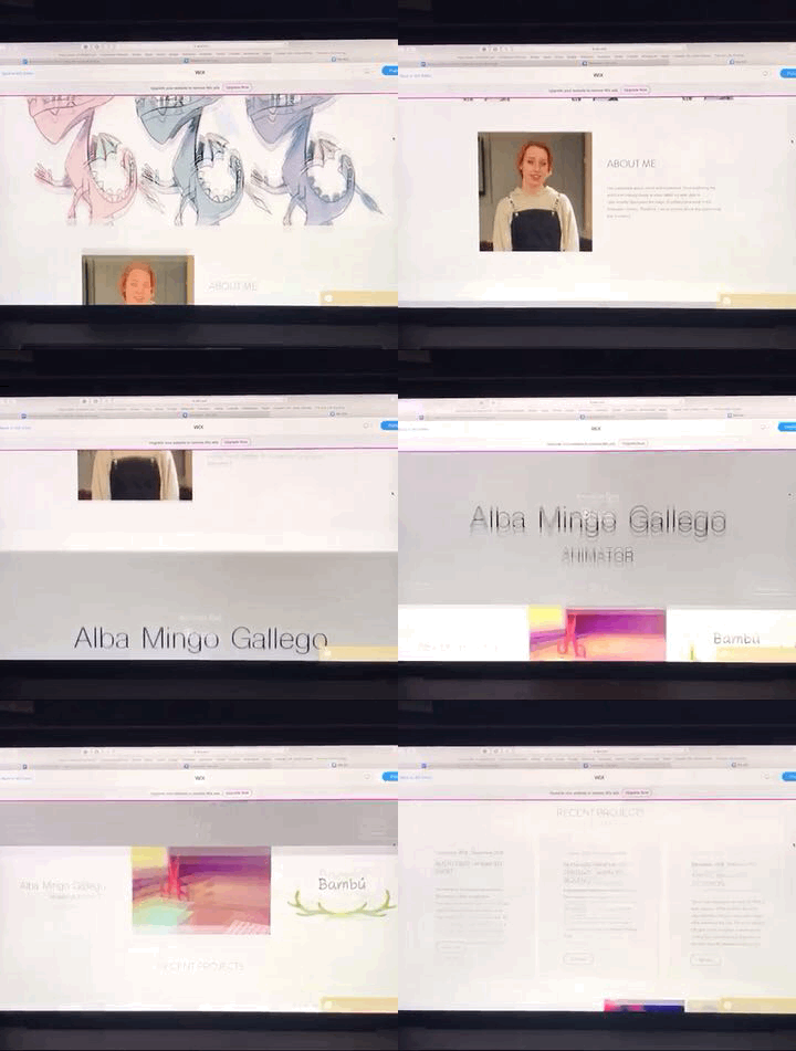
I included an About Me just after the title card, then my showreel + a playlist with my most recent work. I also added a header that contained some of my social media links and that later on would include a menu to the different sections.
If I remember correctly, after these sections, I included some digital images in a photo gallery that you could see scrolling side to side. Another one but for traditional work and finalised the strip with a brief representation of my Instagram account at the very end.
I was kind of digging this whole long, and flowy aesthetics, however many things were just not working out for me.
A few weeks later, after tons of little changes almost made daily, I got closer to what it is now and worked much better. I decided to separate the main sections and also worked out better the style of website that I wanted to have. I liked the cleanness of the constant white background that allows the work to pop up by itself. And so I had this sections in my header to go to:
Home
ALBA MINGO GALLEGO
Colour enthusiast. 2D Animator.
Image of an old character design
Reel & Film
Showreel and a playlist of all my audiovisual work altogether
recent projects section
three recent projects explained briefly with links to pages dedicated to them
Gallery
Digital work (mostly related to animation projects rather than illustrations and such)
Traditional art (actual drawings etc)
About
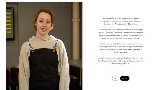
photo of moi
a small bio that was still a work in progress
an also work in progress CV - just some skills and education for now
Contact
the city where I am based
email
social media links
contact form
Then the CV went out of the About page to have its own page. Also, I made a PDF version of it, which I am quite proud of for now - I will talk about it more in depth later.
I was every day coming back to my website and seeing that some things were not quite right just yet, and I could not work out what it was... until I did! I came across this website while doing my daily research: http://alimacdoodle.com and really liked the menu that she used. All words with four letters. The clicked something in my brain and led me to almost the final look of my website - for now anyway.
I ditched my ‘home’ page as it was a bit useless. It was only giving the first impression and showing my name. However, my name was already on the header, and after that first impression, you were forced to go somewhere else as there was nothing to see there. Before entirely ditching it, I tried to add my Tumblr account at the bottom, but I did not like it after a few days of considering it. So I got rid of that.
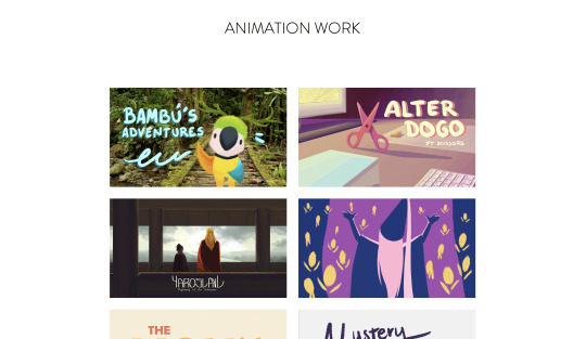
I changed the name of the page were my reel was for ‘reel’ and later for just ‘work’ because of not only my showreel but my whole animation work was going to be in here. I figured out that cause I already had some hidden pages dedicated to some projects, in particular, I thought it would be a good idea to actually separate them all. I put the showreel at the top of the page and then the eight videos that I wanted to show. When you clicked on them, they would open on expand, while having on the left a bit of info about them. However, I had these three extra pages for those three more significant projects in particular. So, after working it out for a few days, I actually created a page for each one of the videos/projects that I wanted to show and linked each video to those. During my first tutorial with Mhairi, a classmate pointed out that it would be more fitting those links to be images rather than a video, cause when you clicked on them, they would not open a video on expanding anymore but a whole new page. And so I changed that too, which also got me working for a few days on a nicer cover for all of my videos. I updated them both on Vimeo and on my new website.
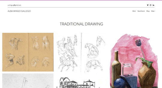
For my gallery, I decided to get rid of the digital bit as it was mainly style frames, character sheets, etc. for the projects that were on my work page. I put those images in the pages about their projects making them a bit more enjoyable too. And so only this page only my traditional work and life drawing were left, Mhairi helped me decided how to call it which ended up being ‘sketchbook’. This longer word broke the idea that the previously mentioned website inspired me of having this short words in the header. However, I do like the name for that section, and so I went for it anyways.
For my About and Contact page, I actually put them together as ‘Meet’, following the short-words idea. I put it so that if you click on it, you will go to my About Me page, but if you just hover, you would also get the choices: contact and CV. During one of the tutorials, it was also suggested to me to put the CV somewhere else, so I later on decided to include it at the end of my Bio text. We also discussed whether the contact page was too hidden there. However, the header that appears in every page contains both my email and my social media, so it should not be really a problem to find my contact even if someone is in a rush. I also added a Contact button along to the CV one after my bio.
My bio took weeks to write as I tried different approaches and saw what people thought about each one of them. I asked a few lecturers and got great feedback from them. In the end, my about me says:
Hello there! I'm a Norwich-based animation student.I'm currently in my second year of Animation at the Norwich University of the Arts, specialising in 2D Animation. I have always been a visual and crafty person. Since an early age, I have had a passion for the arts and I have been working for them to become my professional career. As they say, 'find a job you enjoy doing and you will never have to work a day in your life’ Before Animation, I studied Fine Arts for a couple of years while participating in a sculpture studio in the evenings. I was able to do some commission work that gave me some early experience in working with clients. I love learning about other cultures and exploring the world. I come from Zaragoza, Spain, where I did my Spanish Baccalaureate in Artsbefore coming to the UK.
Which I think that summarises well the topics I wanted to mention, gives a warm and somehow interesting feeling and does not feel like a cv 2.0.
I also decided to keep the photo I included there after checking on many people that it was ok and didn’t bring out weird reactions. People agreed on it being a professional photo, and so it was fitting.
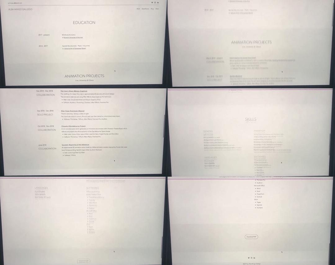
The contact page stayed pretty much the same. While the CV got a complete change of style. I did my cv both on the website and in a downloadable PDF.

I included the same info in the same order. I will soon have to update the Ponyo project, both here and everywhere else on my website. Mhairi liked the layout and overall look of it. The only things that pointed out were that: in the printed cv, the first things that she would look at would be the software that I know and use; and something that would make her go ‘uuuhhh’ would be the languages. So she suggested me to put these two on top of the education even, rather than at the very end of the page however that might mess up the layout. I understood what she meant, but for now, I prefer it as it is. Another thing that she mentioned was the cv on the website was only black and white + some light grey. She suggested me to add some hits of colour or small drawings that connect it better with me and my work.
Then, I came back to my ��work’ page and removed my showreel from there, I did a home page again and put it there along with my name again. I thought about the layout and colours of this front page for a long time and arrived at this last final version were my name is all in one line, the tagline is now ‘- 2D Animator & Colour Enthusiast -’ and the showreel is in the middle and does not open in expand neither plays automatically.
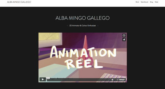
As you can see, I also designed a nicer cover for my reel and actually updated it and changed it once more so that I am happy with it now:
vimeo
I got rid of some bits that were bothering me since Christmas and went straight to the point. Now I am really proud of it!
For my home page, I had this idea of having a darker background rather than a white one cause I wanted to keep that clean and minimalistic look while not making it look too empty or boring. I choose specifically something dark so that it acts kind of like a cinema, the colours would pop up better against a black rather than a white background too. Though, I avoided using pure black.
What Mhari had to say about these decisions were that she liked it but that she had some prejudices about the colour choice particularly. She told me that not choosing a pure black is a good choice but that the grey that I went for looked out of a template and not like if I did all the mental process of deciding it etc. She suggested two ways of fixing these issues: to use this grey somewhere else on the website so that it would look more consistent and as a conscious choice. Or the one that she really encouraged me to do: to change the grey for a lighter one so that it would look less trendy and more like a personal and original choice. I personally thought about the first choice, and I still do. As for the second one... I chicken out cause I am scared to use an ugly grey tbh.
Now, the only thing it is left mentioning is the blog. I decided to include a blog on my website halfway through the making of my website, and since then everyone has been continuously asking me ‘are you sure about that????’. I decided to have a blog on my site because:
I think it’s a way of getting to know me better - pop in a post and read a couple of paragraphs
It is a good practice for me to keep up to date with exciting topics about the animation industry, and it prepares me for future conversations where I can bring them out
It shows some consistency as well as activity on my website
And some other reasons - such as having the perfect excuse to go to film premieres more often
In a nutshell, I think a blog is fitting for me - cause as you can see I don't really mind typing and typing if I have to - and has some potential. The only downside is that if for some reason I stop being consistent and publishing there it would give an awful image, in which case I would hide that page until it is alive again.
I worked in my blogs for a few weeks now, and I wanted to do something else with it, and so I came up with this:
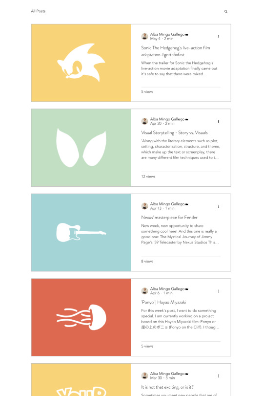
I decided to write every Saturday - or every two Saturday when very busy - and add an illustration of mine using iconography related to the subject and using the same four colours over and over for it. For now, I am digging the looks of it, and I have been able to keep up with it, so I am really excited and proud of it.
But yeah, I hope this can kind of make it up to not having posted more regularly all my progress etc. I tried to cover every relevant change that I made, but I am sure there were more than I could have mentioned if I did my daily blogs on this project too etc. This last term I had a really hard time organizing my work, my life and my mind. But I tried to do my best in every project, so I hope that can save me just for this time!
0 notes
Text
500th movie celebration
Last month I have quietly passed the 500th movie landmark on my Tumblr, so I decided to make a post with text instead of pictures for a change.
Five and a half years ago, I have decided to create a Tumblr, my own personal space where I would upload film frames, mostly so I could remember all the many movies I watch. By associating an image to a title, it helps to maintain my mind fresh and pinpoint exactly why I loved or despised a certain movie, linking them to the people I have watched them with and the surrounding circumstances.
The criteria is simple but methodical: no more than one post per day, all films I watch are represented even if I am ashamed of having spent time with them, all films are represented only once regardless of the amount of times I’ve re-watched them throughout the existence of the Tumblr.
I like to watch Artsy Avant Garde movies. Trash movies. 80′s “classics”. 70′s sleaze. Documentaries, a whole lot of them. Surrealism. Nouvelle Vague. The occasional Hollywood blockbuster. Skin. I usually get complaints from people about the amount of nudity represented in the Tumblr.
Movies, regardless of how bad they are to the viewer, always mean something special to someone, so I respect them all.
To celebrate the 500th movie landmark, I decided to pick 50 of the ones that evoke the most vivid memories in me. Quality and circumstance were the deciding factors. Random order. I recommend them all.
The Virgin Spring (Ingmar Bergman) - An inspirational exercise on mythology, symbolism, and pacing.
Philanthropy (Nae Caranfil) - Romanian New Wave is my latest passion. This one is a highlight. A very entertaining tutorial on how to scam and be scammed.
Wings of Desire (Wim Wenders) - Poetry in motion. Falling in love every day.
The World is Big and Salvation Lurks Around the Corner (Stefan Komandarev) - A road movie, on a bicycle. Friendship, memory gaps, backgammon.
The Red Turtle (Michael Dudok de Wit) - If a movie makes me cry, it goes to the favorites bucket. The story is simple, the animation is fluid, the outcome is expected. Yet, its message is always powerful.
The Imposter (Bart Layton) - More than a very compelling story of deception and manipulation, this documentary shines due to its brilliant editing. Made me feel pity, anger, compassion and repulse, often at the same time.
American Movie (Chris Smith) - If you love movies, then you cannot skip this documentary about a film director who makes his life mission to finish his crap movie, despite lack of funds, means, and talent. Funny and heartfelt. Highly quotable.
Mustang (Deniz Gamze Ergüven) - Growing up as a woman in traditional Turkey. A feminist look on a closed society. Beautifully shot.
Mad Max Fury Road (George Miller) - A throwback to a time when action movies were being made with a sense of movement and a requirement for suspension of disbelief. Amazing cinematography, highlighted in the recent “Black & Chrome” edition.
Nights of Cabiria (Federico Fellini) - The fruitless search for true love. Finding it, losing it, finding it again, losing it again, getting up, trying again. “Everything I’ve ever let go of has claw marks in it”.
Bicycle Thieves (Vitorio de Sicca) - A masterpiece. The importance of a bicycle as an instrument of survival in 40′s Italy. Puts things into perspective. Nothing can be taken for granted.
Underground (Emir Kusturica) - In my opinion, the greatest Kusturica movie. The sad story of a country that no longer exists.
The Hourglass Sanatorium (Wojciech Jerzy Has) - A very surreal experience where time and space are meaningless. Living in a lucid dream.
Despair (Rainer Werner Fassbinder) - The only Fassbinder movie I ever watched to date. I always want to watch more of him, but somehow keep forgetting. This movie makes justice to it’s title, despair creeps in slowly, but overwhelmingly by its end.
Mary and Max (Adam Elliot) - A claynimation film about friendship and mental health. Funny and melancholic. People should write letters to their friends more.
Blue is the Warmest Color (Abdellatif Kechiche) - A beautiful love story.
The Grand Budapest Hotel (Wes Anderson) - Twee as fuck, like all Anderson’s movies. This man can do no wrong.
Blue Jasmine (Woody Allen) - I have a special interest in movies related with mental health. The last great Woody Allen movie to date.
Grave of the Fireflies (Isao Takahata) - I don’t think I’m exaggerating when I claim that this is the saddest movie ever made. It took me days to recover from the emotional impact it left in me. War makes victims of us all.
Teorema (Pier Paolo Pasolini) - What would you do if you have been touched and subsequently abandoned by Divinity? The final scene is one of my all time favorites.
Forbidden Fruit (Dome Karukoski) - Two girls escape from a oppressive religious cult and experience life for the first time. The scene when one of the girls watches a movie for the first time, in a theater, left a good memory in me.
Forbidden Zone (Richard Elfman) - I like musicals too! This one in particular was scored by Danny Elfman, who also plays the devil in its most memorable scene. A weird freakout of a movie. Specially recommend the colorized version that adds up to the surreal atmosphere.
Enter the Void (Gaspar Noé) - To be seen on a big screen with the best speakers money can buy. Intense psychedelic experience. Stay on the safe side, remain sober while watching this one.
My Best Fiend (Werner Herzog) - I find most of Herzog’s documentaries to be very relaxing. Not this one. Klaus Kinski was a fabled asshole. Werner Herzog is an eccentric lunatic. How these two geniuses managed to work together without killing each other (although both came very close to it) is definitely documentary material. An intense story about friendship, respect, and guttural hate.
The Big Lebowski (Joel Coen & Ethan Coen) - My favorite Coen brothers film. The week from hell on an otherwise quiet and unremarkable life. Improves with repeated viewings.
Mulholland Drive (David Lynch) - Spent years analyzing and trying to make sense out of this movie. I only understood it upon giving up on my quest. My favorite Lynch movie.
Female Convict Scorpion: Jailhouse 41 (Shunya Itō) - 70′s Meiko Kaji is a Goddess. A talent wasted in exploitation movies. Her eyes talk louder than all of the movies’s dialogue. This film is a Pink Women-in-Prison Japanese cheap thrill on surface, but the amount of symbolism and surrealism adds weight to a paper-thin plot. And the title song was borrowed to Tarantino’s Kill Bill. Truly one of my favorite movies ever.
Battleship Potemkin (Sergei Eisenstein) - Soviet Propaganda? Yes. Compelling gut-wrenching story? Yes. Cinematic masterpiece? Yes. Regardless on how you feel about the topic, there is no question that the Odessa steps sequence is a work of art.
The Holy Mountain (Alejandro Jodorowsky) - Watch in on psychedelics, or don’t bother.
Heima (Dean deBlois) - A documentary about Sigur Rós’ return to Iceland. Even for people who are not fans of the band, the landscape is undeniably beautiful.
Django Unchained (Quentin Tarantino) - I am finding the latest Tarantino efforts to be a tad boring on repeated viewings. I usually love them when I see them on cinema, but then abandon them half-way when I try to watch them at home. But this one passed the home test, so it gets my thumbs up!
Disquiet (João Botelho) - Squeezing in a Portuguese movie due for national pride reasons. Not that I care much about those things. But I believe more people should watch this movie. The dialogue is lifted from my favorite poetry book, written by Fernando Pessoa. Heavy, dark, contemplative narrative.
Baraka (Ron Fricke) - There is a particular documentary style associated with both Ron Fricke and Godfrey Reggio that I find very appealing. Visual snapshots of people in their homelands. The silent contrast between traditional and modern. And the omnipresent feeling that all life is meaningless and mankind is a just a random occasion on a ball floating in space. Baraka is the best of all.
Rashomon (Akira Kurosawa) - There is nothing in the World like Kurosawa’s samurai movies, and no better samurai than Toshiro Mifune. Rashomon rises above the other excellent Kurosawa movies by its symbolism and usage of light. A murder story told by four different characters. The truth is somewhere in between the lies.
Dogtooth (Yorgos Lanthimos) - A perverse tale of innocence and isolation.
Gomorra (Matteo Garrone) - Disturbing stories from Napoli’s crime underworld. Realistically shot, no sugar coating, no happy endings, no poetic criminals.
Kids (Larry Clark) - I had this one on VHS, a double feature that also included Trainspotting. Found memories attached to this movie, I saw the actors as a parallel to the kids in my street. Several of the participants in the movie are dead or living miserable lives nowadays. Just like the street kids from my youth.
A Woman Under the Influence (John Cassavetes) - It is not easy to get into this director. And this is a psychological scarring movie. The audience is led to descend into madness like its main character.
Down by Law (Jim Jarmusch) - “I scream, you scream, we all scream for ice cream.”
Daisies (Vera Chytilová) - My most popular post for some reason. An excellent, imaginative, innovative, playful, senseless fun movie to watch.
Taste of Cherry (Abbas Kiarostami) - A man’s quest to end his life. The ultimate taboo.
Black Orpheus (Marcel Camus) - Greek Mythology meets Brazilian Slum. A wonderful, poetic ending makes up for some dull parts in between. Excellent soundtrack!
The Cabinet of Dr Caligari (Robert Wiene) - Insane expressionist film with lovely painted backdrops that add a sense of depth and misdirection to its scenes. Timeless movie experience!
Amélie (Jean-Pierre Jeunet) - Modern Fairy tale. Inspirational. Makes me want to enjoy life more.
Oldboy (Park Chan-Wook) - Part of the Vengeance trilogy, I picked Oldboy because I now realize that I haven’t seen Sympathy for Lady Vengeance again ever since I started this Tumblr. Both films are excellent tales of twisted revenge. Oldboy’s fight scene has inspired a generation of copycats.
Spring Summer Fall Winter... And Spring (Kim Ki-duk) - Episodes of the life of a Buddhist monk, from childhood to old age. The wheel of life and rebirth. As Buddhist as it gets.
Fear and Loathing in Las Vegas (Terry Gilliam) - This got me into Hunter Thompson. There’s no such thing as too much drugs.
Battle Royale (Kinji Fukasaku) - A high school class is taken to a remote island and instructed to kill each other until only one survives. Classic 80′s video game plot, tickles the nostalgia bone just right without resolving to remakes and rehashes. Incredibly fun!
House (Nobuhiko Ôbayashi) - A horror movie, a comedy, a fever dream, an art-house lysergic extravaganza. Don’t know what to make of this movie, just that watching it is an amusing experience.
Band of Outsiders (Jean-Luc Godard) - I love all Anna Karina’s movies with Godard, so it’s hard to pick one. I went with Band of Outsiders because of its dance sequence. Godard had fun while experimenting with filming techniques, and this feeling is contagious to the audience.
Thanks for reading and sticking around.
4 notes
·
View notes